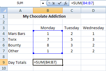
Formulas in Excel:
How to create a formula in Excel?
Every formula in Excel begins with an equal sign (=). You can use the formulas that are all ready saved in Excel or you can add the word of the opperation you want to resolve for example:
- Sum
- Average
- Min
- Max
- Mode
A formula can be a combination of numbers or cells.
For example to sum:
1. Select a cell (A18)
2. Put the "=" sign.
3. Add the word Sum
4. Use a parentheses to begin the operation.
5. Drag the elements or cells you want to sum.
6. Close using another parentheses.
7. Hit enter to see the result.

Type of graphs and charts:
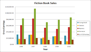
Bar Chart
This chart shows all the differences
between the data you entered; it is an easier way to compare values and
information.
Line Chart
Line graphs are really useful because it is
really easy to notice changes in values that vary a lot. It is an easier way to
represent the change of values, like temperature or data in a period of time.
XY Scatter Plot Graphs
Scatter Plot Graphs show the relationship
among the values in a certain data series or two groups of numbers in one
series of xy coordinates. They are really useful to organize scientific data.
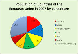
Excel Pie Charts
It represents the percentage or
proportional data of the information you have. It is a way to organize
percentages because you can notice how much you have of certain thing in a
really easy way to understand.
Area Charts
The Area Chart is useful when you need to
emphasize in the magnitude of change (temperature, speed, air conditions,
population,work, profit) over time.
Doughnut charts
The Doughnut Charts display the information
or data in rings, each ring represents a data series. It also represents the
relationship of certain parts of the information entered. It can contain more
data series, than the other graphs.
Radar Charts
A radar chart is useful to compare the
values of data. It shows the changes of relative values to a center point. (All the values are centered on one specific
point)
Surface Charts
A surface chart is used when you are trying
to find combinations between the information and data you have. It can be done
between two sets of data.
Column Charts
A column chart shows information/data that
is changed over a period of time. It is a really easy way to compare
information.
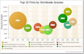
Bubble Chart
The
Bubble Chart compares three values; the size of each bubble indicates the value
of the variable. It can be represented with a 3-D visual effect.
Stock Charts
The Stock Charts are normally used for
stock price data and also for scientific data. It can also represent changes
during a period of time.
Cylinder, Cone, or Pyramid Charts
The cylinder, cone, or Pyramid Charts are
like bar/column graphs but you can add
effect to the column or bars.

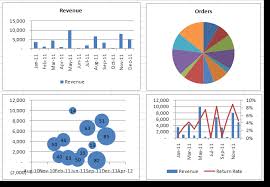
Bar Graph:
Pie Graph:
Bubble Graph:
How to add a graph or chart?

1. Select the cells you would like to use for the graph or chart.
2. Select Insert form the Menu Bar and then choose the type of graph you would like to use.
3. Modify the information and the graph as you want.
Charts:
Formulas: